Choosing Kitchen Colors: Playing with Space and Ambiance
The color palette you choose for your kitchen is more than a mere aesthetic decision; it’s a powerful tool that can influence the perception of space, evoke emotions, and create a harmonious atmosphere. In this exploration of color choices for kitchens, we’ll delve into the nuances of color psychology, spatial effects, and how to make informed decisions to transform your culinary space into a visually stunning and functional masterpiece.
1. Understanding Color Psychology
Color psychology delves into the emotional and psychological impact of colors on human behavior and mood. When selecting colors for your kitchen, it’s essential to consider how different hues may influence your cooking experience and overall well-being.
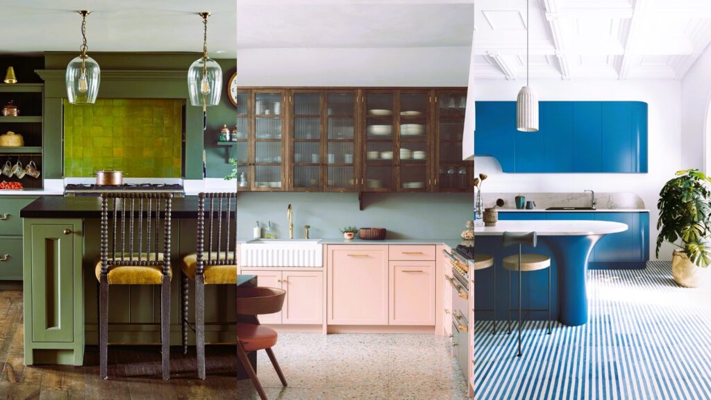
- Warm Tones: Colors like reds, oranges, and yellows are known to stimulate appetite and create a cozy, inviting atmosphere. They can add warmth and energy to the kitchen but should be used in moderation to avoid overwhelming the space.
- Cool Tones: Blues, greens, and purples are considered calming and refreshing. These colors are ideal for creating a serene and tranquil kitchen environment. Cool tones work well in spaces where a sense of relaxation is desired.
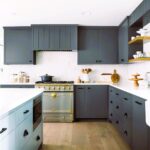
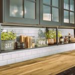
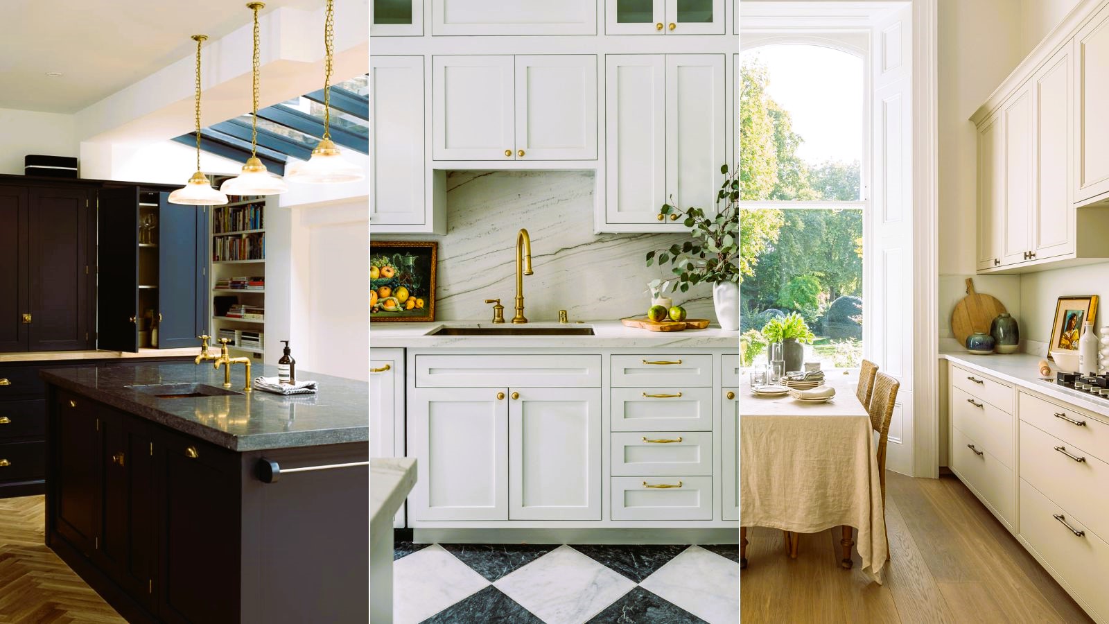
- Neutrals: Whites, grays, and earth tones are timeless and versatile choices. Neutrals provide a clean and sophisticated look, allowing for flexibility in accent colors. They also contribute to a sense of spaciousness.
2. Making Small Kitchens Feel Larger
For smaller kitchens, the right color choices can create an illusion of space and openness. Lighter colors, especially whites and soft neutrals, reflect more light and make a room feel more expansive. Consider using a monochromatic color scheme, where walls, cabinets, and countertops share similar hues, eliminating visual boundaries and contributing to a seamless look.
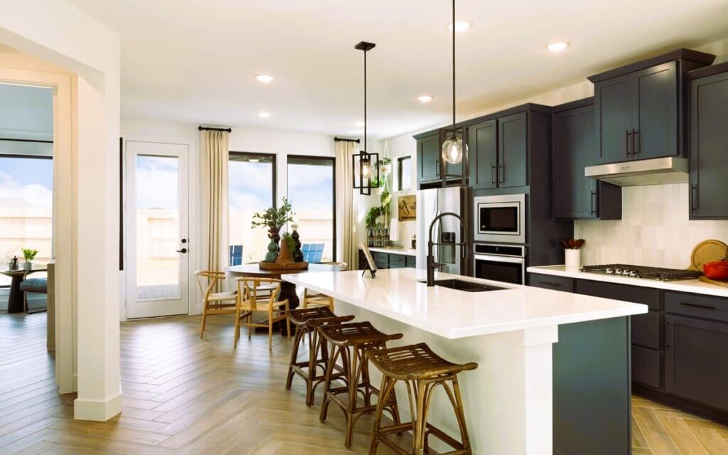
3. Adding Depth to Larger Kitchens
In contrast, larger kitchens offer the opportunity to experiment with a broader range of colors without feeling cramped. Darker tones, such as deep blues, charcoal grays, or rich browns, can add depth and coziness to expansive kitchen spaces. Incorporate these darker hues through accent walls, cabinets, or kitchen island surfaces to create focal points and visual interest. You can read about how to choose a kitchen layout here.
4. Creating Contrast for Visual Appeal
Contrast in color choices can enhance the visual appeal of your kitchen. Pairing light-colored cabinets with a dark countertop or incorporating colorful backsplashes against neutral walls adds visual interest. Striking contrasts draw the eye and contribute to a dynamic and well-balanced design.
5. Utilizing Accent Colors for Personality
While a neutral base provides flexibility, introducing accent colors injects personality into your kitchen. Choose a bold color for accessories, such as bar stools, pendant lights, or small appliances. These pops of color create focal points and break up monotonous color schemes.
6. Embracing Trends with Caution
Trends come and go, and while it’s tempting to embrace the latest fashionable colors, consider the longevity of your choices. Opt for trendy colors in elements that are easier to update, such as accessories or decor, while sticking to timeless hues for more permanent features like cabinets and walls.
7. Harmonizing with Natural Light
Natural light plays a significant role in color perception. If your kitchen receives ample sunlight, the colors may appear brighter and more vibrant. Consider this when choosing colors to ensure they complement the natural light and create a harmonious atmosphere.
8. Exploring Two-Tone Kitchen Designs
A popular trend in kitchen design is the use of two-tone color schemes. This involves combining two distinct colors for cabinets, such as upper cabinets in one color and lower cabinets in another. This approach adds visual interest and allows for creative expression without overwhelming the space.
9. Considering Maintenance and Durability
Practicality is crucial when choosing kitchen colors. Consider the maintenance and durability of your chosen hues, especially in high-traffic areas. Darker colors may conceal stains but could show scratches, while lighter colors may require more frequent cleaning.
10. Seeking Inspiration and Guidance
For those seeking inspiration and guidance on color choices, platforms like Wikipedia offer valuable insights into color psychology and design standards. Understanding the principles of color psychology and exploring reputable sources can empower you to make informed decisions that align with your vision and enhance your kitchen space.
Conclusion: Crafting a Colorful Culinary Canvas
Choosing the right colors for your kitchen is a creative and transformative process. By understanding color psychology, playing with spatial effects, and considering the principles of design, you can craft a culinary canvas that not only reflects your personal style but also optimizes the visual and emotional impact of your kitchen space. Whether you prefer a calming oasis or a vibrant hub of energy, the power of color awaits your exploration.